My Stylization Process for Ruby and the Lost Crystals Using a Physically Based Cel Shader.
Game 3D Unreal Computer Graphics Post-Processing SAE Group
Content
1. Context
Ruby and the Lost Crystals is a third-year game project developed at SAE Institute Geneva, in collaboration with Game Programming, Game Art, and Audio Engineering students. The goal was to create a vertical slice in six months, providing a semi-professional experience where each discipline played a key role.
Set in a ruined fantasy world, the game follows Ruby and her companion Sapphire, who must work together to restore scattered crystals Ruby through physical interactions and Sapphire with magical projectiles.
In this post I’m going to describe in detail my technical approach to developing the Physically Based Cel Shader for our game, as well as the choices and constraints that led me in this direction.
2. Why a Cel Shader?
Our initial artistic direction focused on simple and highly stylized meshes. We aimed to create a calm and relaxing atmosphere, conveyed through the environment and various props in the game.
Images of reference games for our relaxing visual goal.
Map Map - A Game About Maps. |
Map Map - A Game About Maps. |
Tiny Glade. |
The Witness. |
However, we wanted to avoid an overly smooth, plastic-like appearance in our in-game asset rendering. Low-detail meshes can quickly lose visual appeal if the graphics pipeline is too simplistic.
Screenshot from Jusant. In this example, we can see that the character appears to have a somewhat “plastic” look. This is not a critique of the artistic choice behind it, but rather an observation that we wanted to avoid this type of rendering. Instead, we aimed to push the stylization further.
This is why we opted for a cel shader that would unify all assets within a stylized rendering inspired by The Legend of Zelda series, particularly The Wind Waker HD.
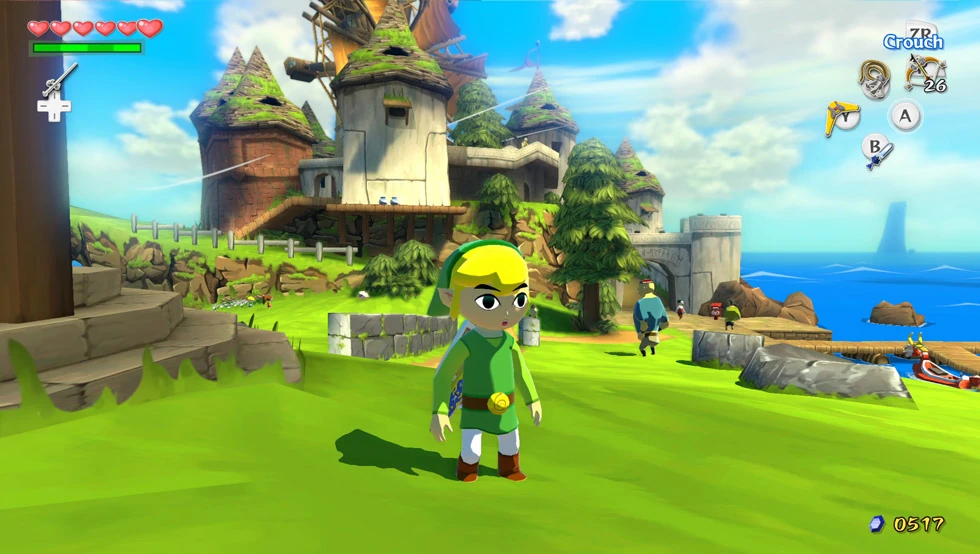
Screenshot from The Legend of Zelda The Wind Waker HD, our primary cel shader inspiration.
3. Technical Direction
There are two main ways to implement cel shading in Unreal Engine: modifying the lighting method in the source version or using post-processing, which is the only stage with access to all lighting data.
We chose post-processing because we were a small team, new to Unreal, had only six months, and were collaborating with Game Art students, making engine modifications risky.
The challenge of working with Unreal’s default graphics pipeline is that achieving a good non-photorealistic result is difficult due to its physically based rendering structure. That’s why I decided to create a physically based cel shader that adheres to Unreal’s graphical rules. This approach also benefited our Game Artists, as it allowed them to keep their standard asset production workflow without additional constraints.
My primary reference for this decision and its technical implementation was Visual Tech Art’s video “Physically Based Cel Shading.” It explains the challenges and constraints of creating a cel shader in Unreal while highlighting why most online resources fail to address all the necessary issues.
Visual Tech Art’s video "Physically Based Cel Shading." My primary reference.
4. Lighting Setup
To adhere to Unreal’s physically based rules, the first step is to properly set up the lighting and tonemapper. I based my approach on insights shared by Eros Dadoli, an Associate Lead Lighting Artist at Massive Entertainment A Ubisoft Studio, who was interviewed by Visual Tech Art.
Video interview of Eros Dadoli by Visual Tech Art
The Directional Light is set to 120,000 lux, with the source angle at 0 to create sharp shadows. The EV (Exposure Value) in the post-process volume is fixed at 12 (both min and max). This setup follows the Unity Lighting & Exposure Cheat Sheet to replicate daytime lighting with a clear sky.
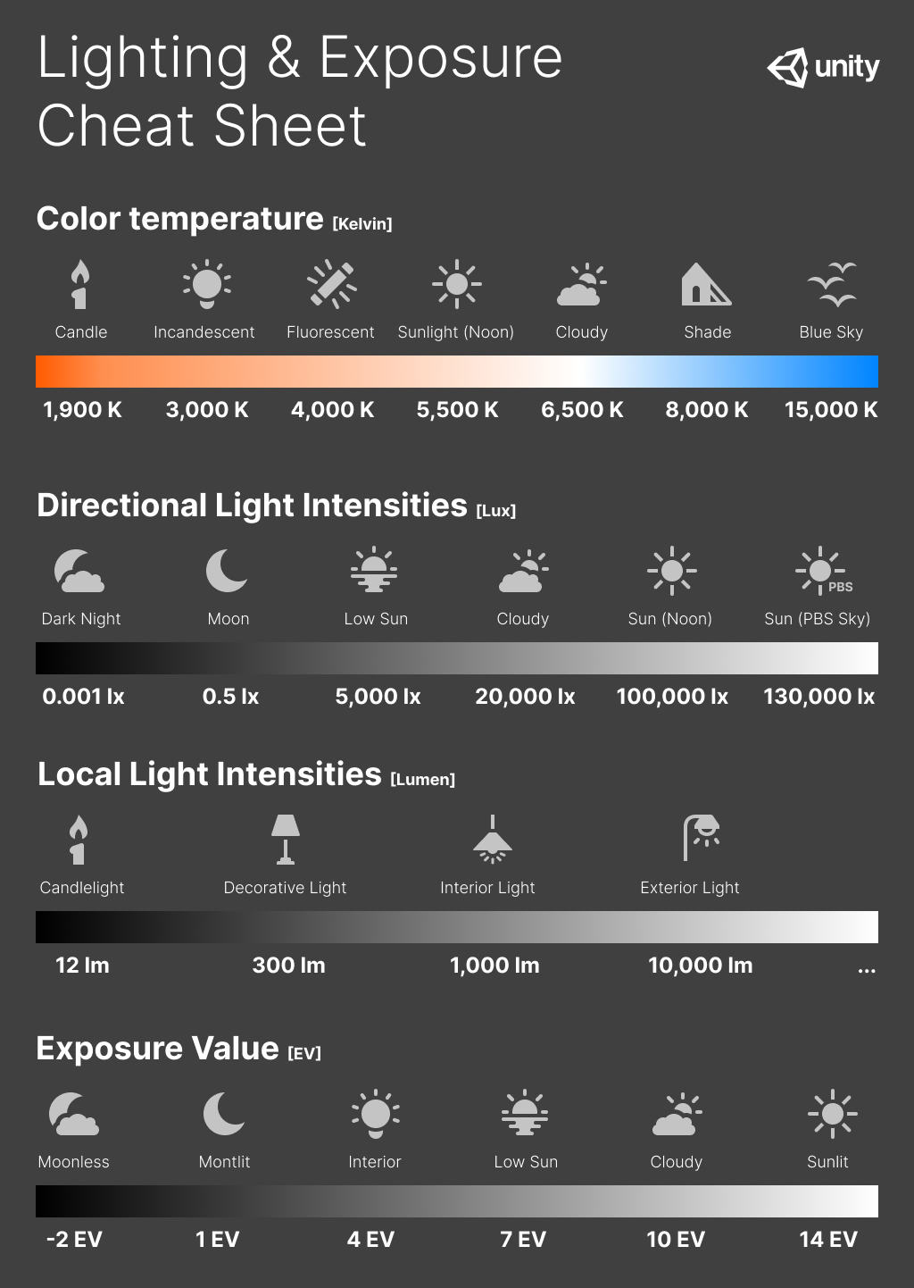
The Unity Lighting & Exposure Cheat Sheet.
Next, I decided to disable shadow casting for the Sky Light because I found that the shaded areas were too dark for a stylized rendering, which negatively impacted gameplay visibility.
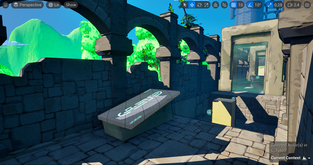
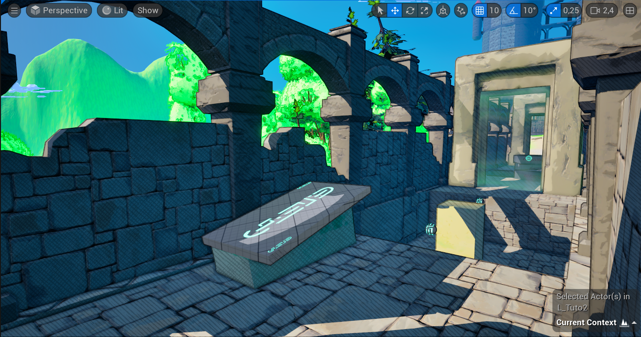
Comparison: Sky Light casting shadows (top image) vs.
Sky Light without shadows (bottom image).
I also added a blue tint to the Sky Atmosphere, following advice from Nicolas Vallée, to create bluer shadows and enhance spatial depth.
Comparison: Default Sky Atmosphere color (top image) vs.
Blue-tinted Sky Atmosphere (bottom image).
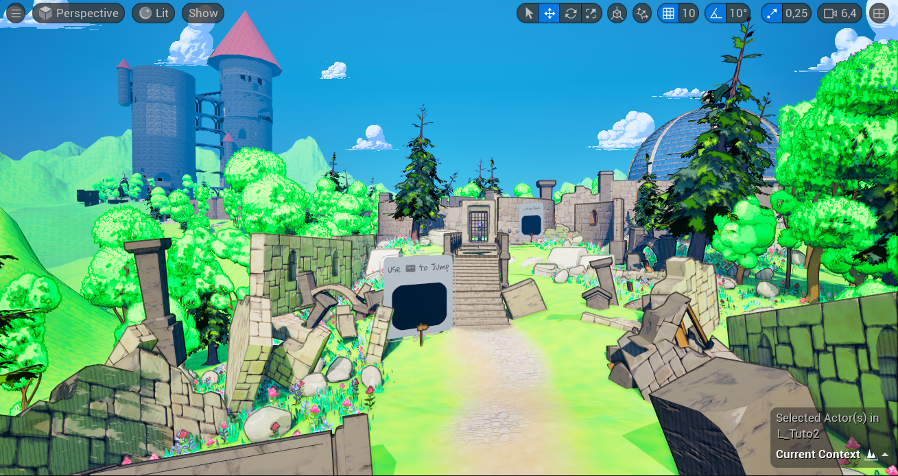
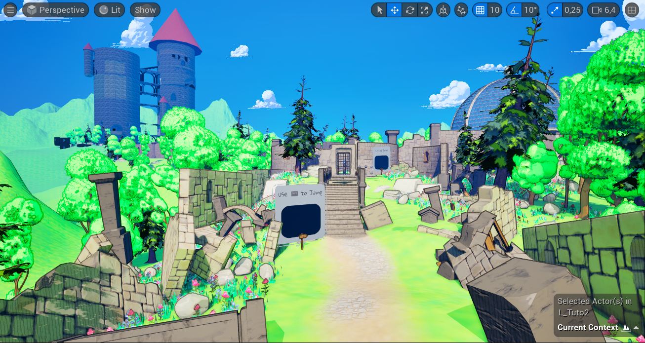
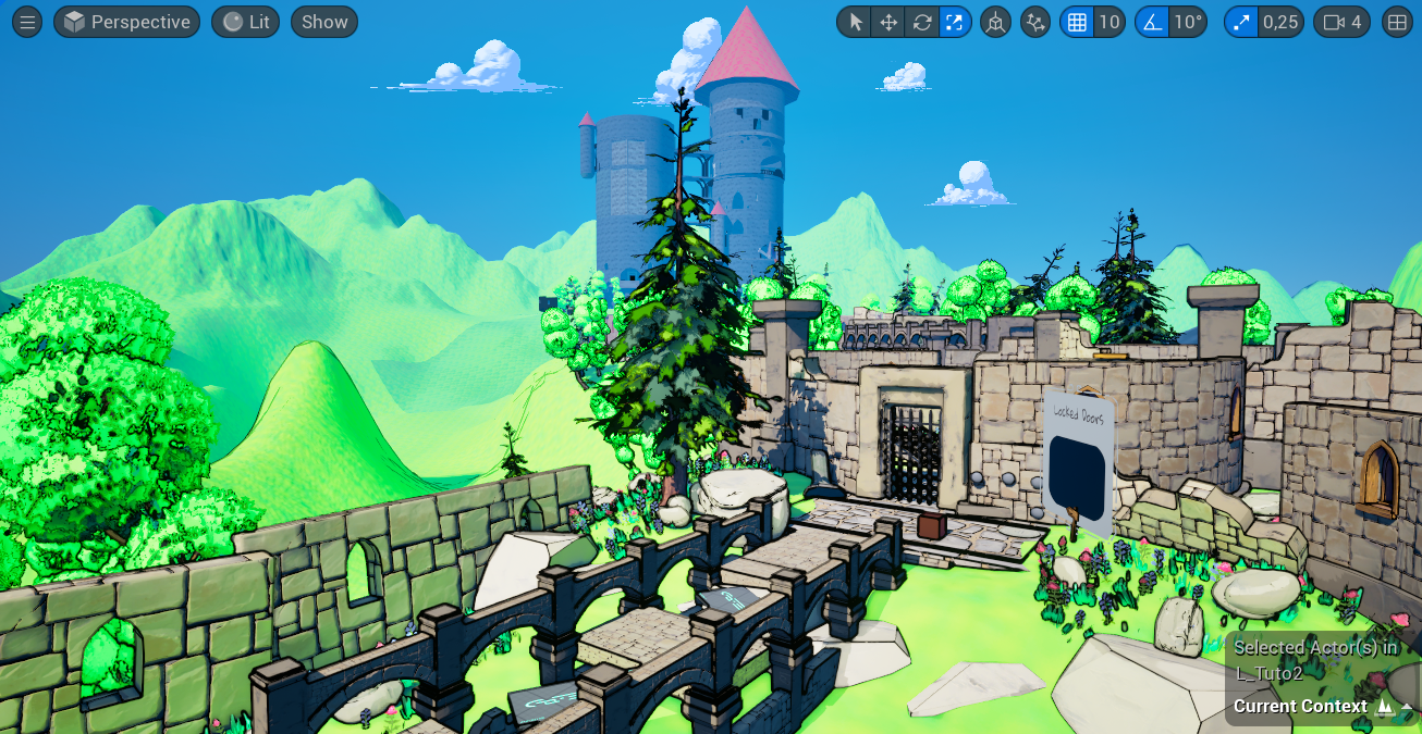
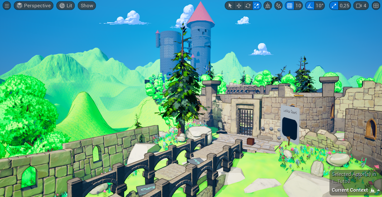
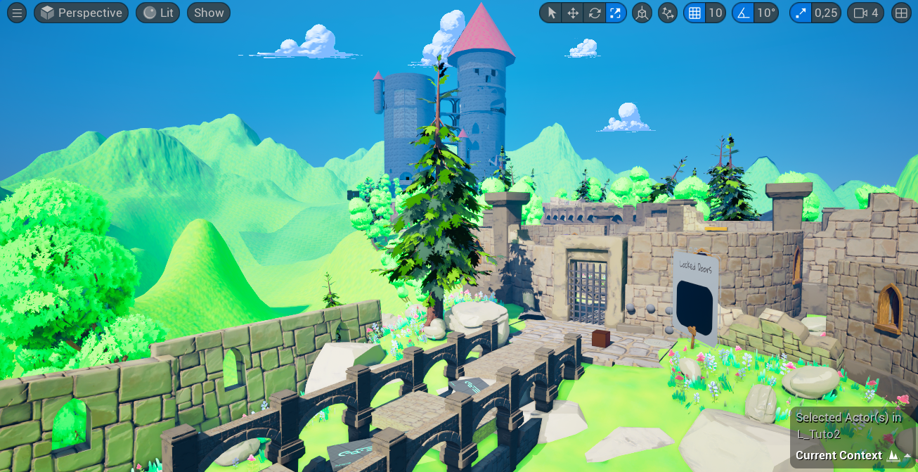
Finally, I baked the level’s lighting with the Directional Light set to Static to achieve global illumination, creating a green ambient light in vegetated areas. However, after building the lighting, it is essential to switch the Directional Light back to Stationary or Dynamic so that it can cast dynamic shadows for gameplay.
I intentionally chose not to use Lumen, Unreal 5’s real-time global illumination system, because it caused visual artifacts when trying to create color bands for the cel shader.
Comparison: Without baked global illumination (top image) vs. With baked global illumination (bottom image). We can clearly see the impact of global illumination with the greenish tint added to the walls.
5. Tonemapper Setup
All tonemapper values are controlled via the post-process volume. I set Film Slope to 0.7, Toe to 0.3, and White Clip to 0, creating a dull, low-contrast, low-saturation image. This maximizes data retention for post-production flexibility.
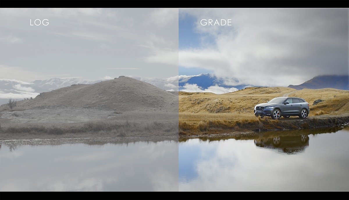
Comparison of a log image (left) vs a grade image (right). The log image has lower saturation and contrast, showing a more compressed dynamic range. This provides more flexibility for color grading and post-production adjustments.
For color grading, I set Saturation to RGB(1.2, 1.5, 1.5), reducing the Red component to prevent an overly intense green hue. Contrast is set to RGB(1.25, 1.25, 1.25). In the Misc section, I lowered Blue Correction to 0.05 to maintain vibrant blues. The Temperature is set to 5200 for a natural sunlight tone.
Finally, I increased Highlights to RGB(1.12, 1.12, 1.12) to enhance brightness without washing out details, preserving natural contrast. These tweaks create a balanced, vibrant environment that supports our stylized and relaxing atmosphere.
Comparison: Default tonemapper values (top image) vs. My tonemapper values (bottom image). The difference is noticeable, particularly in the enhanced green and blue tones.
6. Development
As discussed earlier, the cel shader was implemented in post-processing before the tonemapper runs (Blendable Location = Scene Color After DOF in Unreal 5).
The foundation of the shader and the game’s lighting comes directly from Visual Tech Art’s video. However, I added and modified certain elements to create a more unique style for our game, notably by incorporating hatching, adjusting the behavior of the outline, and making a few fine-tuned tweaks in specific areas.
6.1 Theoretical Basis: How to create color bands in a physically based context?
To create the characteristic color bands of a cel shader while preserving realistic lighting, a good approach is to take the brightness value of each pixel by using the maximum of its RGB components. With this brightness value, we can determine the exposure value (EV) needed to correctly expose the pixel in the scene by taking its base-2 logarithm.
Once we have the EV values, the goal is to generate the color bands by quantizing them, rounding them to the nearest integer before converting them back into a brightness intensity. This is done by using the quantized EV values as exponents of a power of two, effectively reconstructing the light intensity in discrete steps, mimicking the banding effect of a cel shader while respecting physically based lighting principle.
Nodes used to quantize luminosity values based on their exposure (EV).
Resulting color bands after quantizing luminosity values.
Next, we restore the original colors by dividing each pixel’s value by its initial luminosity and then multiplying it by the calculated luminosity intensity. Additionally, we can control the number of color bands per EV value to adjust the level of quantization.
Nodes used to choose the number of bands per EV and to put the color back to the image.
The result with the image color back.
6.2 Going Further into Cel Shading Bands
Now that we know how to create color bands without breaking the scene luminosity, let’s start over and create a better code to have more control on the bands and the color we apply to them by working on the hue and the brightness of the image.
First let’s remove the base color from the image to get the luminosity value as before but this time with pure color information including its color. This is done by dividing the pixel value by its base color. Then let’s break it up into its components but this time in HSV (Hue, Saturation, Value/Brightness).
Nodes used to calculate pure luminosity information and the breaking into HSV components.
6.2.1 Adjusting Brightness
First we can create smooth transitions between cel shader bands with two techniques. The first one consists in replacing the base rounding operation of the EV quantization by a smooth curve.
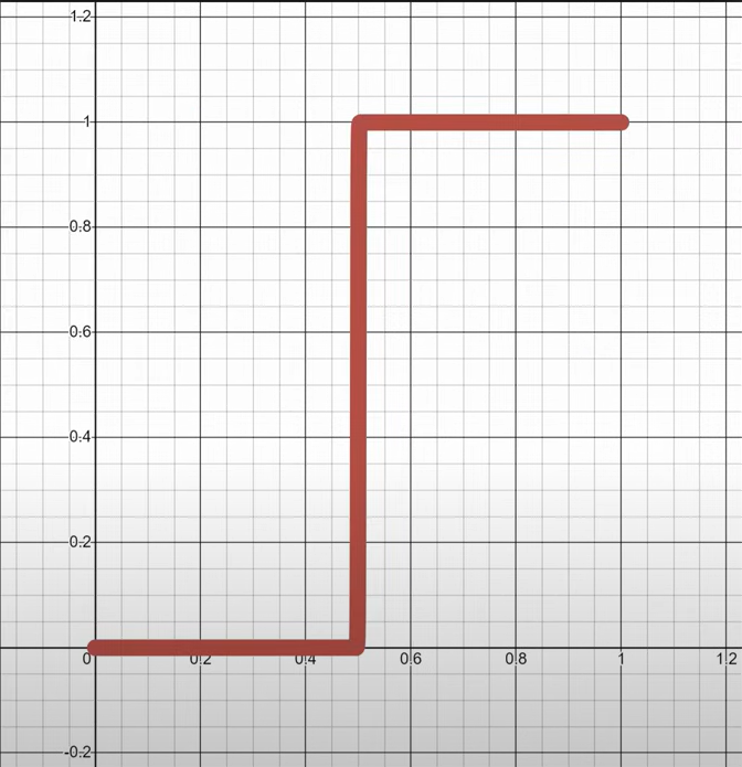
Base rounding function. |
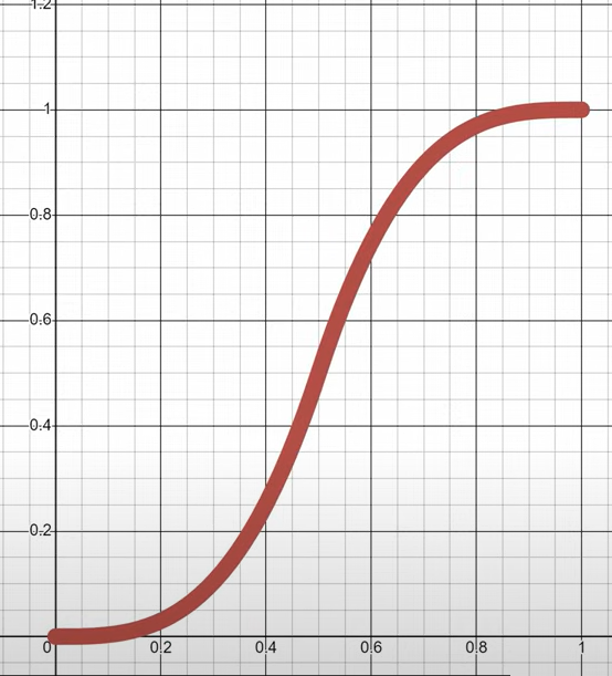
Smooth rounding function. |
The second one simply blends back in a tiny bit of the original brightness value with a lerp to reintroduce some volume. I personally pushed this technique further by adapting the amount of the original brightness value to the roughness value of the pixel. The lower the roughness, the sharper and clearer the band’s transitions, with less light being scattered in different directions. On the other hand, higher roughness leads to more diffusion, resulting in smooth band transitions.
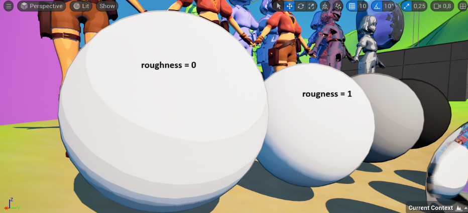
Comparison: Cel shading bands transition with a roughness value of 0 vs 1.
Nodes used to determine the smoothness transition factor based on material’s roughness.
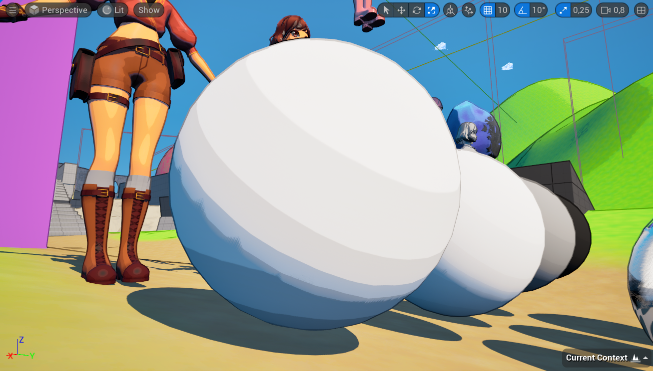
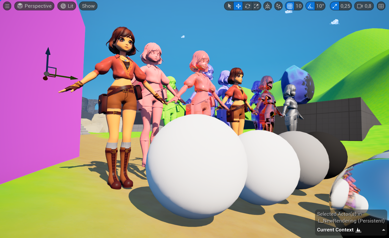
The last tweaks I made on the brightness is on metallic surfaces. First I reduced by three the amount of bands on metallic objects because they had too many of them in my opinion and there were some surfaces where we hardly see the cel shading bands.
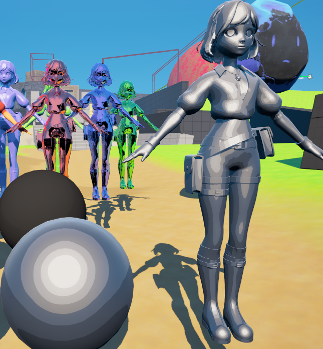
| 
|
Comparison: Default band number on metallic surfaces (left image) vs. Reduced band number. We can see on the left image that the character isn't really stylized because there are too many color bands.
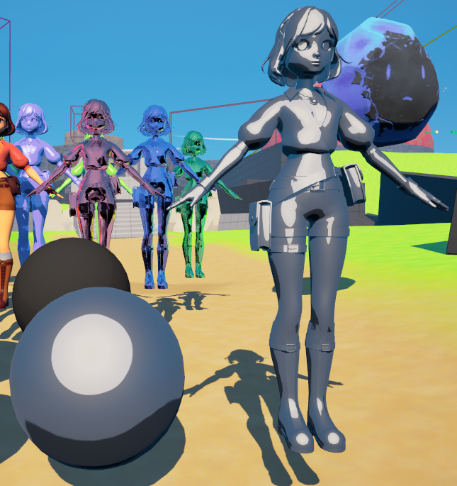
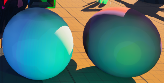
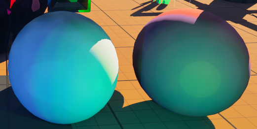
Finally I added a Rim light effect on the metallic objects, highlighting their top part and shading their bottom part. To do so I created a fresnel mask to separate parts which will receive fake reflection from parts which will be darkened. This mask is then multiplied by the scene texture metallic value to calculate the final value which will add or remove some EV from the base one resulting in brighter or darker areas.
Nodes used to create the fake Rim light effect.
| 
|
Comparison: Default metallic surfaces (left image) vs. Metallic surfaces with Rim light effect (right image). We can see the difference on the top of the metallic sphere.
6.2.2 Adjusting Hue
What I did on the hue to increase the stylised look is to reduce the number of colors the lighting can have. Effectively in a stylised drawing, lighting colors will not have an infinite amount of linear transitions. Here I followed the tutorial from Visual Tech Art and restrain lighting color to primary, secondary and tertiary ones. I also added the smooth function to it to blur the transitions between the colors:
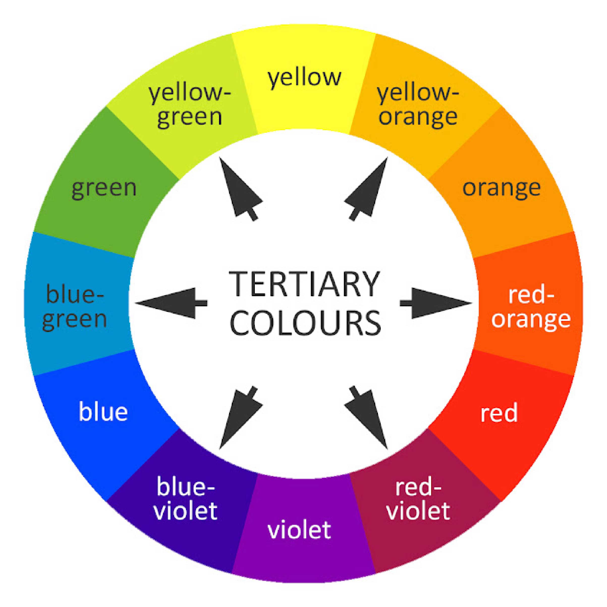
Circle representing primary, secondary and tertiary colors.
Nodes used to reduce the number of color lighting can have and to smooth the transitions between the bands.
Comparison: High number of colors available for lighting with sharp transitions (top image) vs. Only primary, secondary and tertiary colors available with smooth transitions (bottom image).
6.3 Outlines
The outline is an excellent addition to the stylization of a graphical render. I decided to continue working in post-processing by applying a Circular Laplacian Filter algorithm, using Visual Tech Art’s video, “Outline Stylized Material”, as a reference. I won’t present the implementation here, as it would require an entire blog post, but rather focus on how I integrated it into my cel shader.
Visual Tech Art’s video about outline shader.
This video allowed me to implement the algorithm in a custom HLSL node, making it easy to configure inputs and adjust them dynamically. This flexibility notably enables reducing the outline thickness based on the distance between the pixel’s world space position and the camera’s position.
Screenshot of the scene using the basic outline method, showing how the outline gradually fades as objects recede into the distance.
Unfortunately, this version of the outline darkens the image because it doesn’t account for the scene’s exposure. As with the brightness quantization used to create the color bands, I followed Visual Tech Art’s advice and adjusted the outline based on the scene’s EV (Exposure Value), applying an offset to it.
Additionally, I took advice from Nicolas Vallée, who suggested not simply using a basic black outline but instead having the outline darken the object’s base color. Since the algorithm outputs positive values for outlines outside shapes and negative values inside, I was able to retain only the negative values to easily achieve this darkening effect:
Comparison: The scene with an inner outline shading the surface’s base color (top image) vs. the scene without an outline (bottom image).
6.4 Cross Hatching
The idea for cross hatching came directly from Nicolas Vallée. He suggested this technique to bring a hand-drawn effect into shadowed areas, enhancing the stylization of the render.
I opted for procedural hatching rather than simply applying a texture to the shadows. This approach gave me full control over the number of lines, their thickness, and their color. Furthermore, I applied the effect in screen space to simulate the idea that someone had drawn over the game image with a pencil during post-processing. My research once again led me to a Visual Tech Art video, which greatly helped me during the creation process. I encourage you to watch it if you’re interested in understanding the underlying algorithms.
Visual Tech Art’s video about cross-hatching.
I encountered a challenge because the shader in the video worked only in black and white. I had to adapt the hatching code to my physically based cel shader as follows: I created masks based on minimum and maximum EV ranges to isolate the darker areas of the scene. These were divided into multiple levels, increasing the number of hatch lines as the area became darker.
Nodes used to mask areas with low exposure values.
Once the masks were created, the hatching algorithm was applied to generate a texture and a final mask. This final hatching mask was used as the alpha of a lerp, blending between the scene’s base color and the base color multiplied by a factor to control the darkening effect within the hatched areas.
Comparison: Shader without cross-hatching (top image) vs. Shader with cross-hatching (bottom image). We can see that the darker the shadows, the more hatching is present.
6.5 Validation Moments
The first version of the cel shader was very close to the one from Visual Tech Art and was validated by me and Remy, the project’s Product Owner. This version was developed during the proof of concept phase, when the Game Art team was not yet involved in the project.
First version of the cel shader.
When the Game Artists joined the project, we sought their feedback and validated a new version of the shader together, closer to the art direction of Zelda The Wind Waker. This version featured fewer color bands and a simple black outline. It was a classic stylization that we liked because we didn’t want to take risks at that stage of the project.
Second version of the cel shader.
In the final month of the project, Nicolas Vallée, the Head of Game Art at SAE, came to support the Game Art team. He advised us to modernize the shader. He asked me to push the PBR aspects further, add a blue tint to the shadows, create a more subtle outline that darkens object colors, and introduce hatching in shadowed areas.
Final version of the cel shader.
7. Results and Areas for Improvement
Comparison: Unreal’s default render (top image) vs. Stylized render with my cel shader (bottom image).
I am very satisfied with the final result. The stylization works well while respecting the scene’s lighting and Unreal’s PBR rendering pipeline. The outline is subtle and enhances objects in the scene. The hatching adds originality and identity to the game. Of course, not everything is perfect. Here are a few points for improvement that I didn’t have time to explore or fine-tune:
7.1 Hatching
The screen space approach is visually interesting, but it also gives a strange flickering effect in very dark areas, resembling a visual glitch when there’s too much hatching. This is exacerbated when hatching covers characters in shadowed zones.
Screenshot of a dark area showing excessive hatching.
7.2 Outline
My method of keeping only the internal color-darkening outline is a bit rough, which removes some lines resulting from surface normals.
| 
|
Comparison: Subtle inner outline (left image) vs. Basic black outline (right image).
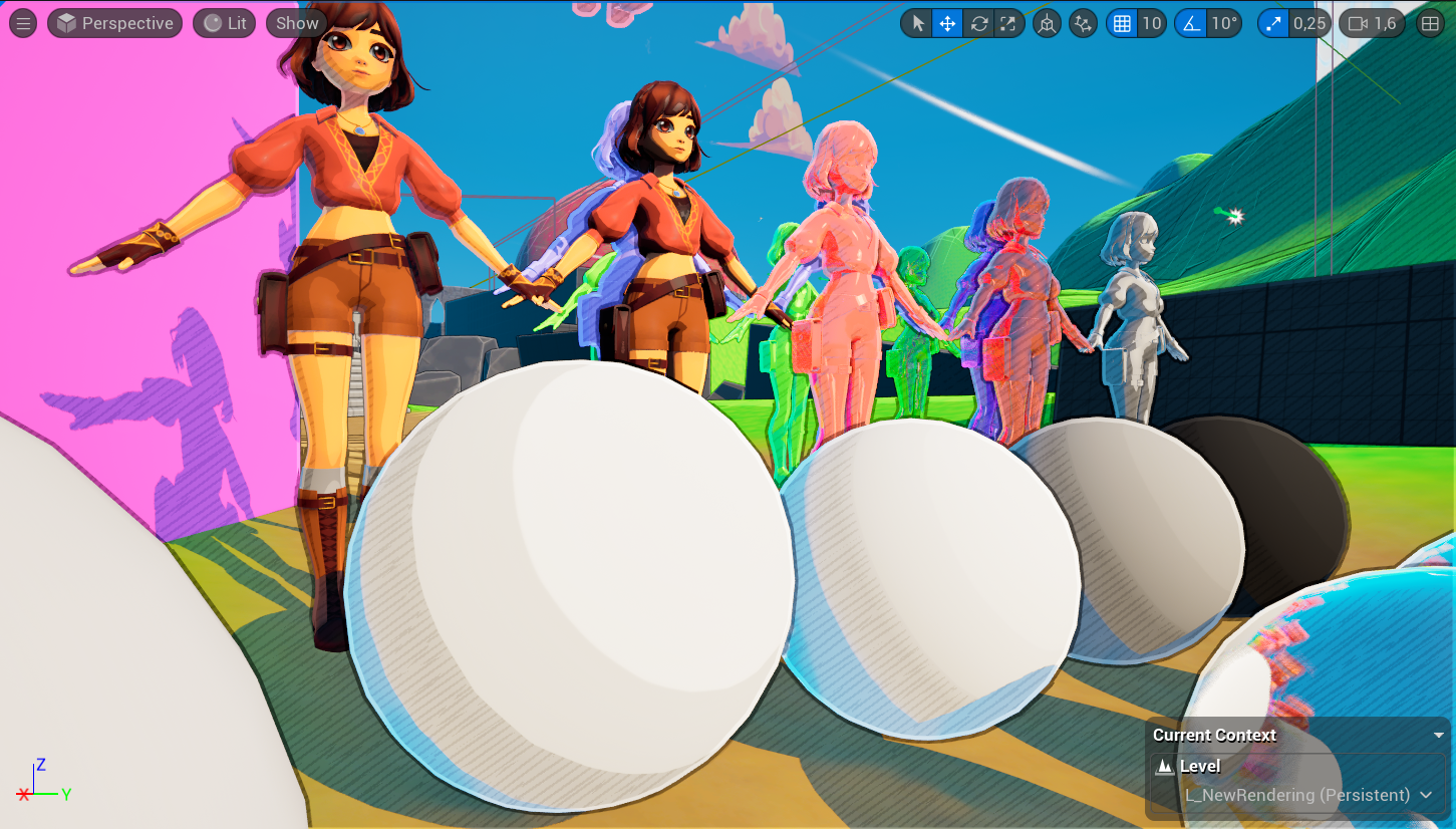
7.3 Treatment of the Characters
The current cel shader on the character could be improved. Hatching should be removed, and the number of color bands reduced to achieve a manga-like style. This simplified approach is used in The Legend of Zelda: Breath of the Wild
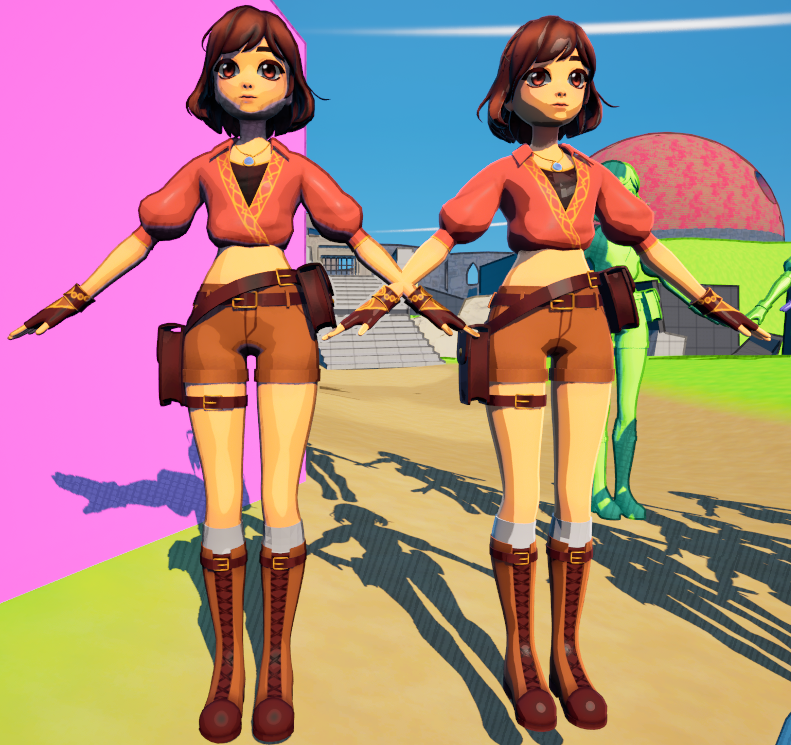
Comparison: Left: Current character rendering vs. Right:Older character rendering with fewer color bands.

Screenshot from The Legend of Zelda: Breath of the Wild. The simple cel shading uses only two color bands, creating a manga style. This is the kind of result I want to achieve for our game’s character.
8. Conclusion
While developing this shader, I learned a lot about Unreal’s PBR properties, realistic scene lighting, shader development in Unreal, and various stylization techniques.
I greatly enjoyed collaborating with artists to refine the visual style until we achieved something we were proud of.
I am especially grateful to Nicolas Vallée for his valuable advice and creative ideas, which gave the game a unique and original visual identity. I am very happy with the final render and proud of what I accomplished.
This was my first time contributing to the artistic direction of a large-scale project, and I believe I did well. This experience reinforced my desire to become a Graphics Programmer after my studies.
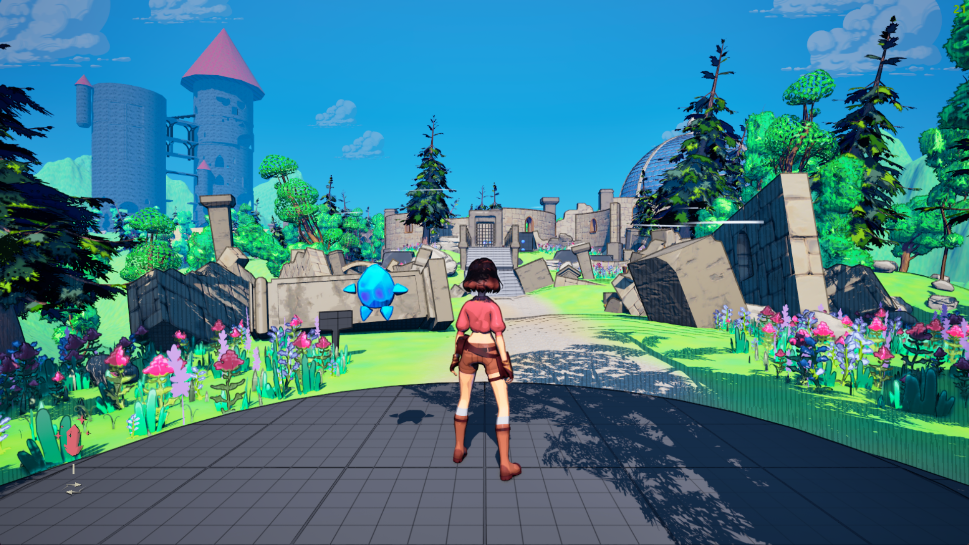
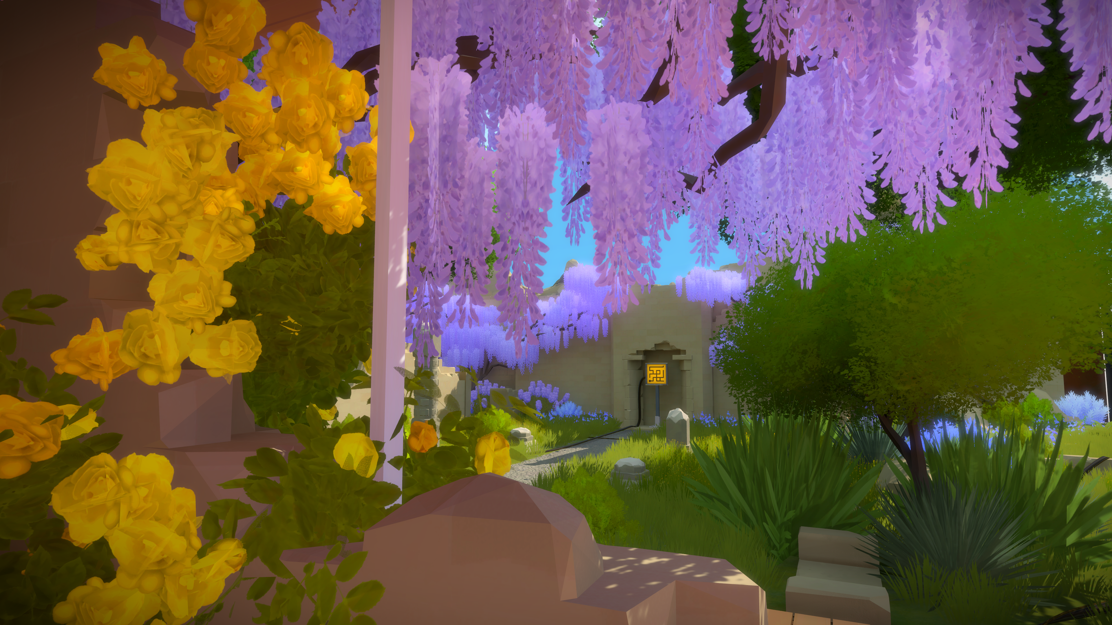
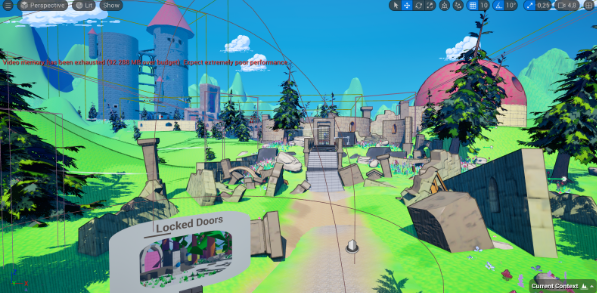
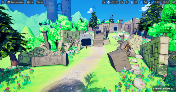
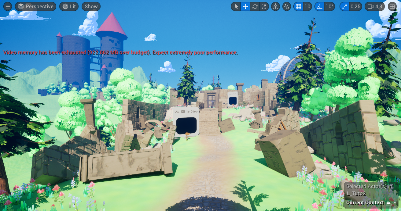
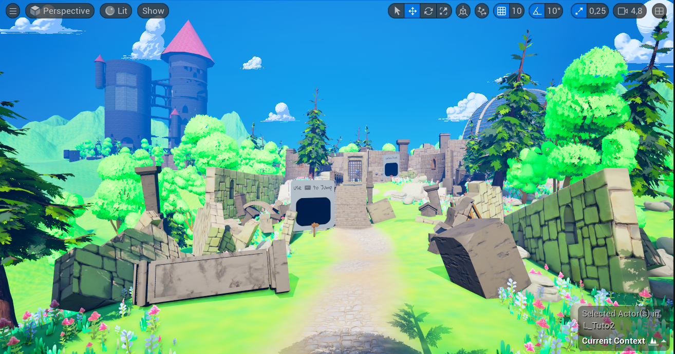
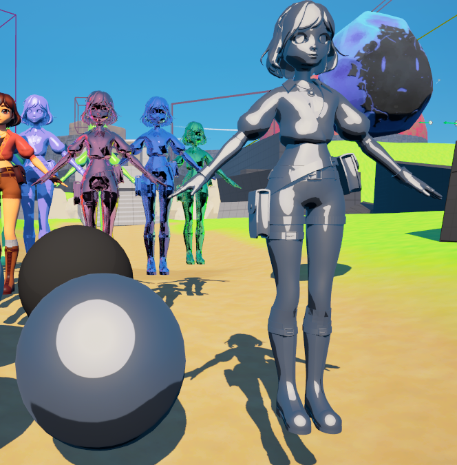
Screenshot of our game on the school deliverable date.